I put this article together to show a bit of the research, thinking, and visual exploration behind the MYR Sneakers social ads campaign. From my client, I received nothing more than a photo of the sneaker and a pretty straightforward brief: “Bro, I need some content for this new sneaker.” Cool. Let’s do some research on sneakers.
1. Sneaker Model & Basketball
I started my research by digging into the sneaker model itself. I learned that it was born from the intersection of two worlds: high-performance basketball (the Jordan line) and skate culture (Nike SB).
The design of the sneaker, and the entire Air Jordan 4 Retro line, represent one of the most important pillars in the history of urban culture and sports footwear. Originally designed by the legendary Tinker Hatfield, the Air Jordan 4 was first released in 1989.
Speaking of Tinker Hatfield, I highly recommend the episode of Abstract dedicated to this legendary sneaker designer. Orly recommended it to me a few years ago, and it’s definitely worth watching.
And while we’re on the subject of Air, I’ll also add Air: Courting a Legend, a film based on the true story behind the origins of Air Jordan. It follows Sonny Vaccaro, a Nike talent scout, as he tries to secure a groundbreaking deal with rookie basketball player Michael Jordan. Really good movie. I liked it.


Okay, back to the case. In 1989, the sneaker was immortalized by two major cultural moments:
“The Shot” — Michael Jordan’s legendary game-winning shot over Craig Ehlo to eliminate the Cleveland Cavaliers in the first round of the playoffs.
Pop Culture — Its appearance in Spike Lee’s acclaimed film Do the Right Thing.

I also remembered White Men Can’t Jump. Even though it came out in 1992, it shares the same aesthetic territory we’ve been exploring. My brother Pablo is a huge fan of that movie. Okay, let’s go back to 1989 and see what things looked like back then.

So far, so good with the sneaker model and basketball. Now let’s take a look at 90s fashion and see how people were dressing back then.
2. 90s Fashion
Fashion in the 1990s was characterized by a more relaxed, rebellious, and minimalist attitude. According to the summary ChatGPT gave me, there wasn’t one single dominant trend. Instead, the decade’s fashion was fragmented into several different movements: Grunge, Pure Minimalism, and the one I was most interested in: Hip-Hop & Urban Style.
With figures like Tupac, Aaliyah, and The Notorious B.I.G., this style took clothing rooted in urban communities and brought it to the global stage.
Key pieces: Extremely baggy pants (baggy jeans), denim overalls with one strap hanging loose, oversized sweatshirts, baseball caps, sports windbreakers, and statement sneakers.
Style: Exaggerated oversized silhouettes that prioritized comfort, attitude, and self-expression.

Okay, cool. So we’ve got the 90s fashion and the sneakers covered. But how does any of this actually help the campaign? Well, my campaign needed photography. And that photography needed art direction, contrast, style and color, shading and lighting approaches, mood, visual tone, and a whole bunch of other decisions.
So all this research helped me consolidate the moodboard, which would later become the visual foundation for my Aesthetics Builder—one of the modules in my reusable AI workflow: Infinite Photo Shoots & Models using variables in Figma Weave.
Basically, the research wasn’t just about collecting cool references. It was about turning those references into a visual system that I could actually feed into the workflow and use to generate the photography.
3. Graphic Design: Aesthetic Movements & Iconic Designers
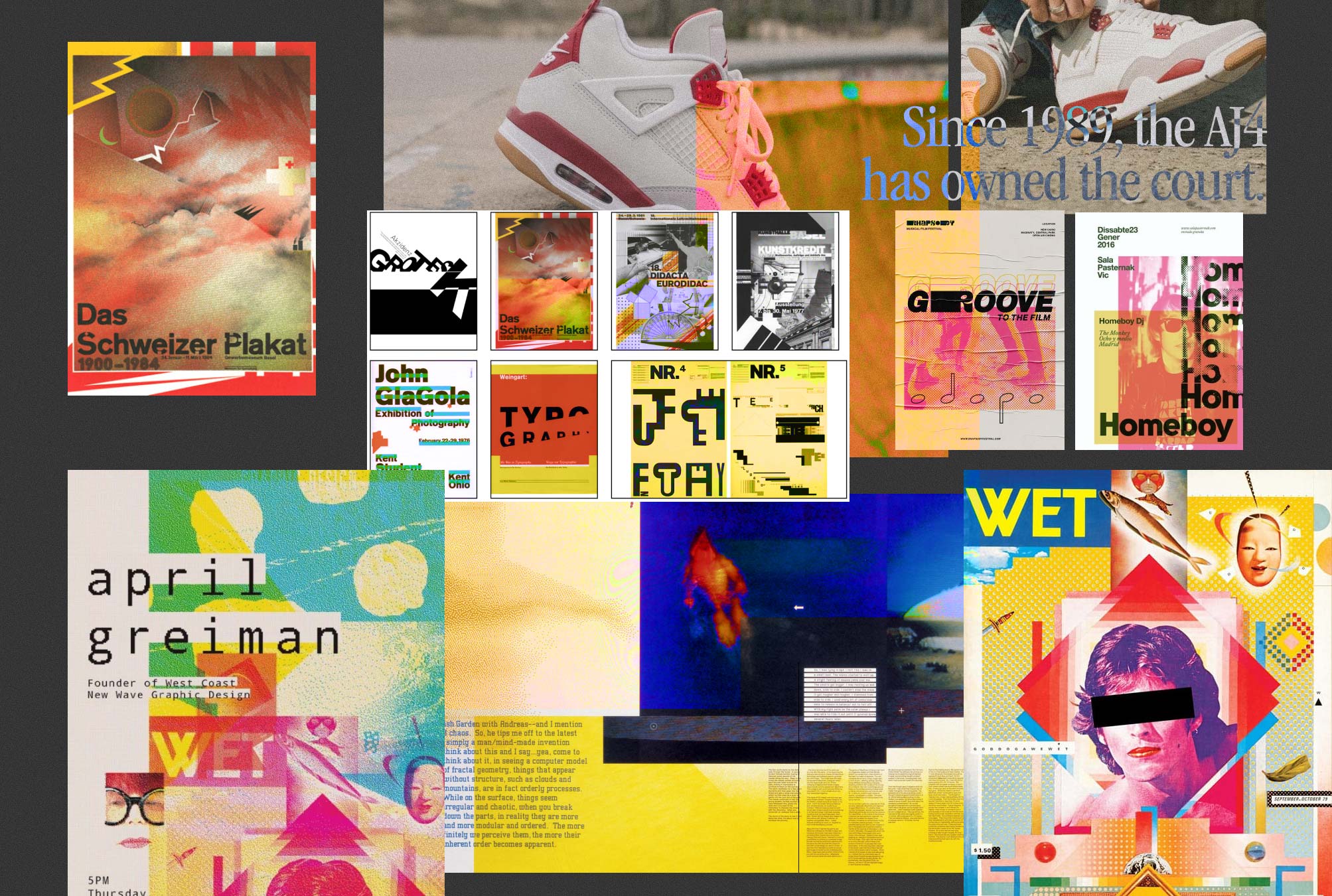
When it came to graphic design, the main references I brought into this project were the New Wave movement, with Wolfgang Weingart as its main exponent, and the birth of digital design, particularly early pixel art, with April Greiman as a key reference.
New Wave
This movement emerged from Swiss design schools, led by Wolfgang Weingart, and quickly spread to the United States. It was a direct rebellion against the rigidity of the International Typographic Style.
Aesthetic: New Wave designers challenged traditional grid systems, mixing typefaces and sizes within the same word, using inconsistent spacing, and layering images through collage-like techniques.
Impact: The movement introduced a stronger sense of texture and depth to printed pages through the use of halftone patterns, dynamic diagonal compositions, and unconventional typography.
Digital Design
The arrival of the Apple Macintosh in 1984, along with the first desktop publishing software, gave rise to a completely new visual language shaped by the technological limitations of early computer hardware.
Aesthetic: Explicitly pixelated curves (aliasing), low-resolution imagery, complex compositions built through layers of digital elements, and bitmap typefaces designed pixel by pixel.
Impact: Designers such as April Greiman and Susan Kare demonstrated that the technical limitations of computers could actually become expressive visual tools, helping establish the aesthetic foundations of the emerging information age.

Taking these ideas—collage-like image layering, mixing different typefaces and sizes within the same phrase, and pixelation, which I eventually translated into a noise treatment in my pieces—led to some of my early iterations:

4. Typographic Exploration Inspired by Apple Ads from 1984
This part happened somewhat in parallel with the previous exploration. If you look at the iteration I just showed you, you’ll notice that the typography is already there—and I haven’t even explained where it came from yet.
The typographic exploration was driven by the campaign concept: I wanted to create a visual break between 1989 and the present day, between basketball and skate culture. To give the campaign that retro, nostalgic feel, I looked at Apple ads from the 1980s, which pioneered this visual language with the launch campaign for the Macintosh in 1984.
80s Editorial Design: Ads often featured a single central image—usually against a gradient or completely white background—combined with a direct, impactful headline at the top and large blocks of explanatory copy underneath.
Extremely tight leading and tracking: A common typographic characteristic of the era was squeezing letters and lines of text tightly together, creating dense and compact blocks of type.

The font of the moment was ITC Garamond (Apple later introduced its own customized version, Apple Garamond). But do you know why it became so ubiquitous?
Before the internet, local print shops and typesetting houses would typically purchase closed font licensing packages. Since the International Typeface Corporation (ITC) distributed its typefaces very aggressively, ITC Garamond was available in practically every print shop around the world.
This created a domino effect: designers chose it because they knew, with a good degree of certainty, that any local printer would be able to reproduce it properly.
Here are some of my early iterations:

But something was still missing: the 1989–present-day contrast. I still needed to integrate the core concept behind this sneaker model: the fusion of basketball and skate culture.
For that contrast, I chose Staatliches.
Staatliches is based on the display lettering created by Herbert Bayer for the cover of the catalog for the first Bauhaus exhibition in 1923. The digital typeface was designed by Brian LaRossa and Erica Carras, with help from Eli Heuer.
• Ideal for: Website headings, book covers, and typographic posters.
• Character: It brings a modern, clean, and structured feel.

5. Color Palette Definition
Since I didn’t have much direction from the brand regarding color palette or a clearly defined set of identity rules, I had to establish a specific visual aesthetic for the campaign—something that could feel distinctive to the campaign while still fitting within the broader brand identity.
So the final palette became a fusion of two things: the aesthetic moodboard that defined the look and feel of the photography, and the colors already present in the sneaker itself.

That said, the final pieces rely mostly on neutral black-and-white tones, so the color doesn’t compete with the most important element of the composition: the photography.
Red and yellow are used more selectively, appearing only in specific pieces where I needed to highlight a major offer or promotion.
6. Final Designs Gallery

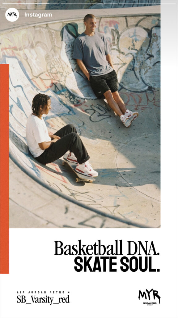
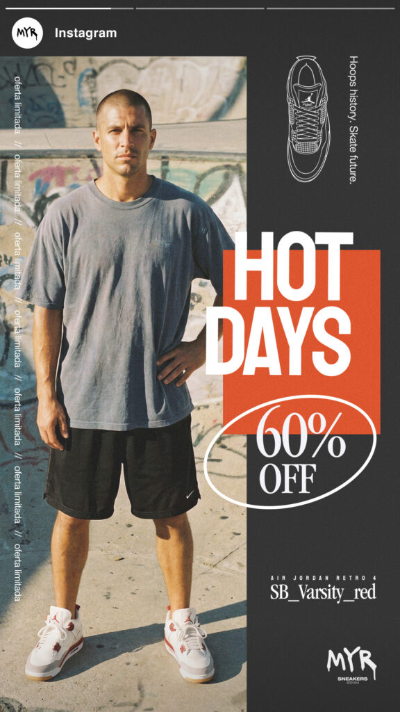
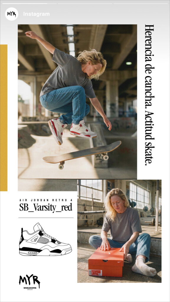
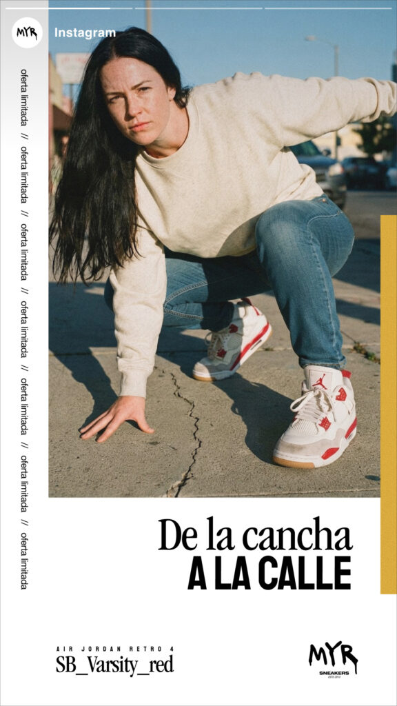
7. Conclusions
The more experimental and collage-driven explorations were visually appealing, but they ultimately pulled attention away from where it needed to be. So, for some of the final pieces, I kept the idea of layering images and graphic elements, but always with one rule in mind: the photography had to remain the main character.
Through the photography, I wanted to communicate much more than just a sneaker. I wanted to convey a style, a sport, a way of dressing, a moment, a sense of belonging. That’s why one of the strongest parts of the campaign was the implementation of an AI workflow that allowed us to control, through variables, the aesthetics, model characteristics, storytelling poses, sneaker model, and photoshoot location.
If you want to see how the workflow was built, I’ve documented the whole process here: Infinite Photo Shoots & Models using variables in Figma Weave. And if you want to see more about the campaign, check out MyR Sneakers Social Ads Campaign.