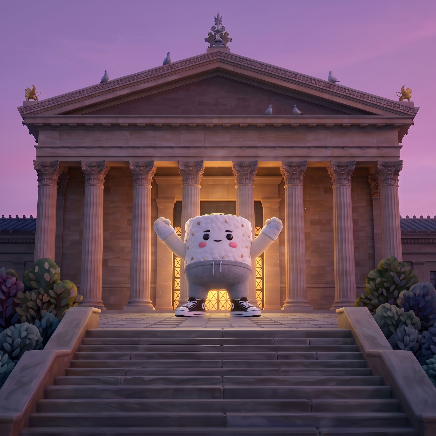
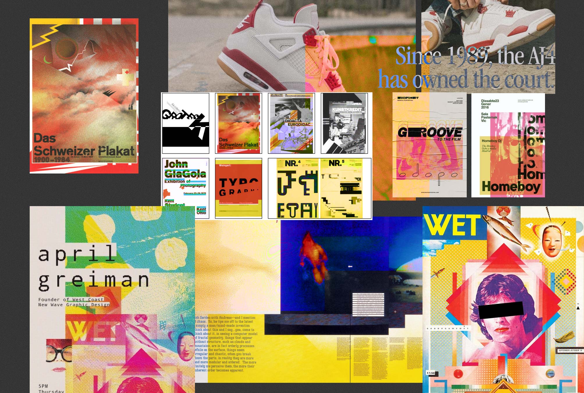
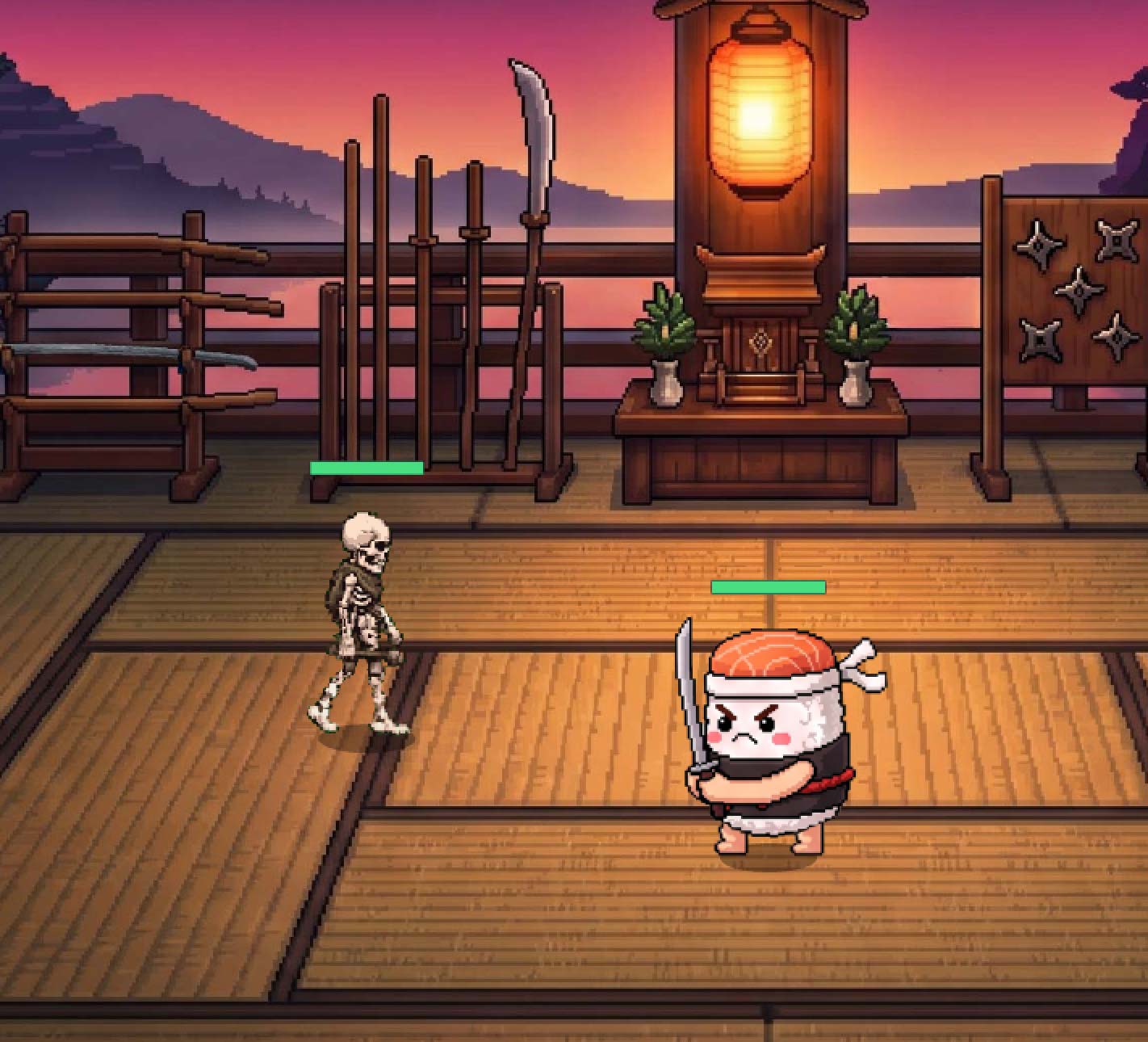
I explored this direction as part of the campaign Nigiris vs. Uramakis in the Niudo Sushi Campaign. I had already defined the design of the main characters, but I still needed to establish the specific visual aesthetic for the campaign.
The challenge was to bring together Pixar-style animated sushi characters with concepts inspired by Japan, sushi, combat, and more—while keeping everything on-brand and consistent with my client’s visual identity.
1. Assets I Had to Work With
I started the exploration by gathering all the materials I had from the client, reviewing previous events and looking closely at their brand identity.

Previous Events by the Brand

Brand Identity: Logo and Main Color Palette.
Alright, let’s leave this here for now and begin our journey through the art of Japan.
2. Ukiyo-e Painting and Printmaking
When you think of Japanese art, the first image that probably comes to mind is that giant wave.
The Great Wave is a work by ukiyo-e master Katsushika Hokusai, published between 1830 and 1833, during Japan’s Edo period.

The Great Wave off Kanagawa (1830–1833), woodblock print by Katsushika Hokusai.
This print is Hokusai’s best-known work and the first in his famous series Fugaku sanjūrokkei.
Thirty-Six Views of Mount Fuji (富嶽三十六景, Fugaku Sanjūrokkei) is a series of ukiyo-e prints consisting of forty-six woodblock prints created by Japanese artist Katsushika Hokusai (1760–1849), produced between 1831 and 1833.

Ukiyo-e flourished during the Edo period (1603–1867) as a popular and accessible art form created for the emerging urban class. Although it began as a painting tradition, its true revolution came with the refinement of woodblock printing, which made it possible to mass-produce prints in series.
What interests me about Ukiyo-e isn’t the technique, but the aesthetic, since most of my final pieces would be digital. I would later use this aesthetic to create my character introduction cards. The idea was inspired by that classic effect where a frame is paused, given a distinctive visual treatment, and then overlaid with a graphic displaying the character’s name.
I don’t know who originally came up with it, but it’s a visual device you often see in films by directors like Guy Ritchie and Quentin Tarantino. Personally, though, I mostly remembered it from Jaguar’s introduction in an episode of Rick and Morty.
Jaguar presentation frame from ‘Pickle Rick’ the third episode of the third season of Rick and Morty.

Hugo Stiglitz presentation frame from ‘Inglorious Basterds’ from Quentin Tarantino.

Cousin Avi presentation frame from ‘Snatch’ from Guy Ritchie.
Here are my character introduction cards. If you want to learn more about the thinking behind the character development, check out my article: Creating Adorable Sushi Pieces that are also Serial Killers.
3. Postwar Historical Figures and Masters
Jumping forward in time and digging a little deeper into Japanese advertising and graphic design, I started looking into the work of two major references:
• Tadanori Yokoo is one of Japan’s most influential postwar artists, graphic designers, and painters. Often referred to as the “Japanese Andy Warhol,” his work is known for its provocative blend of psychedelia, Western pop art, and the traditional aesthetics of woodblock prints (ukiyo-e).

Tadanori’s use of those long shadows inspired some of my early iterations:

The other designer I looked into was:
• Yūsaku Kamekura (1915–1997): Considered the “founding father” of modern Japanese graphic design. He successfully combined Constructivism and Western Swiss-style symmetry with the minimalist essence of Japanese design.
His most internationally recognized work was the complete visual identity he designed for the 1964 Tokyo Olympics.

Nah, Yūsaku’s style didn’t really give me any major takeaways for this particular project. Moving on.
4. Japanese Wrestling Posters
Where I did find some inspiration was by exploring Japanese wrestling posters, particularly Puroresu.
Puroresu (プロレス) is the term used for professional wrestling in Japan. The word is an abbreviation of the Japanese pronunciation of “professional wrestling” (purofesshonaru resuringu). While it shares the choreographed nature of American wrestling (WWE) and Mexican lucha libre, it is deeply distinguished by being treated and presented almost like a legitimate combat sport.
The ones I found most interesting to explore were the retro, or “Showa”, style posters, rooted in nostalgia and associated with Japan’s postwar period from the 1950s through the 1970s. They are characterized by bold primary colors and blocks of text set in typefaces with strong, heavy strokes.

5. Font Selection
I started looking for typefaces with a Japanese influence and came across Ungai.
• Inspiration: The typeface is a “faux-Japanese” (or oriental-emulation) display font that adapts the angular, geometric structure of Japanese Katakana characters into the Latin alphabet.
• Philosophy: The designer created the cuts to symbolize a fast-paced, high-action modern world.
Everything looked great at first, but once I started testing the font across the different applications, things quickly turned into a bit of a mess. It was difficult to read and, honestly, just annoying to look at.
Here are some of my early iterations:

So I continued the exploration and leaned toward Roc Grotesk.
Roc Grotesk is particularly well suited for editorial design, corporate branding, signage, and high-impact headlines.
• Headlines & Display: Its heavier weights have a strong visual impact, making them ideal for magazine covers, packaging, advertising posters, and website headers.
• Limited Space: The Compressed and Condensed versions are specifically designed to work in narrow columns, allowing you to fit a lot of information into a small space without sacrificing readability.
In the end, I kept Ungai exclusively for the Sushi Night identity, while using Roc Grotesk ExtraBold for the headlines where I wanted more visual impact. The Compressed version also proved extremely useful for fitting in all the secondary information while maintaining a clean and well-balanced composition.

5. Reusable Assets Mini Library
Alongside the visual exploration and typography research, I started compiling elements as I gathered references and built the moodboard.
It wasn’t a formal style guide, nor did I define specific applications or anything that elaborate. Instead, I built a small library of assets that became useful as the campaign grew, allowing me to create different pieces for different formats while maintaining visual consistency.

On the left, the moodboard with references and elements to steal. On the right, my finalized assets, ready to be reused throughout the campaign. *Everything was used except for the red-and-white barrier, which I eventually dropped because it brought too many Christmas associations.
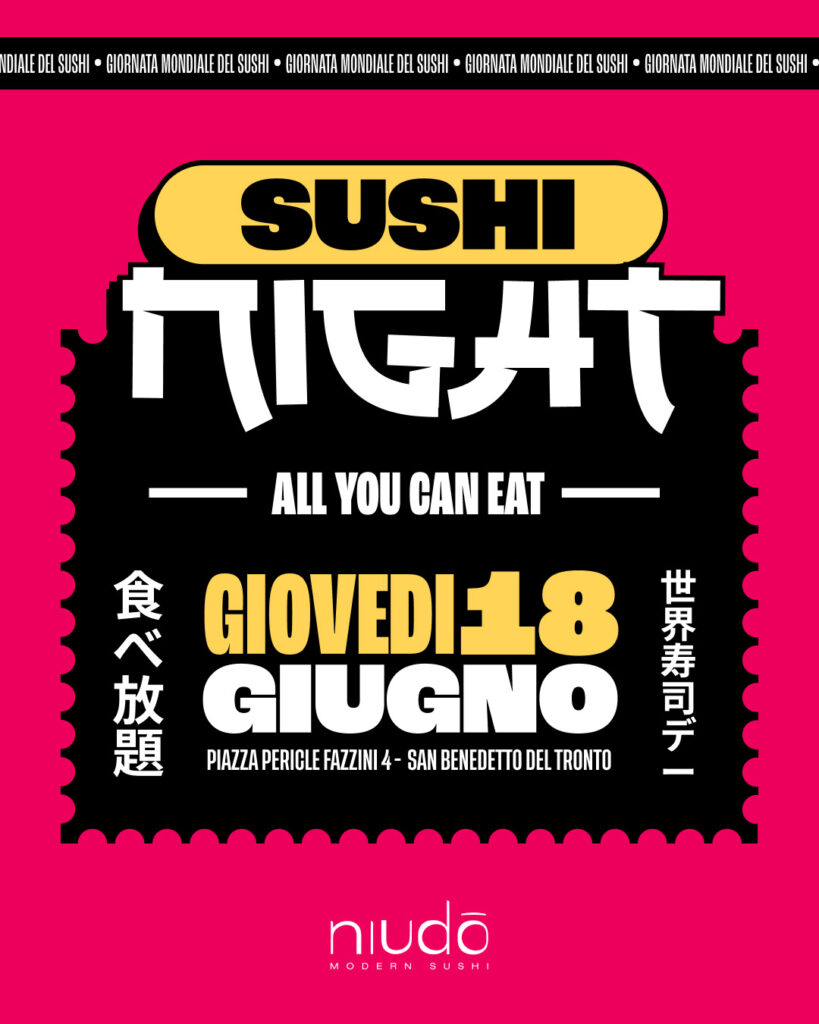
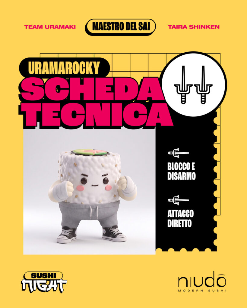
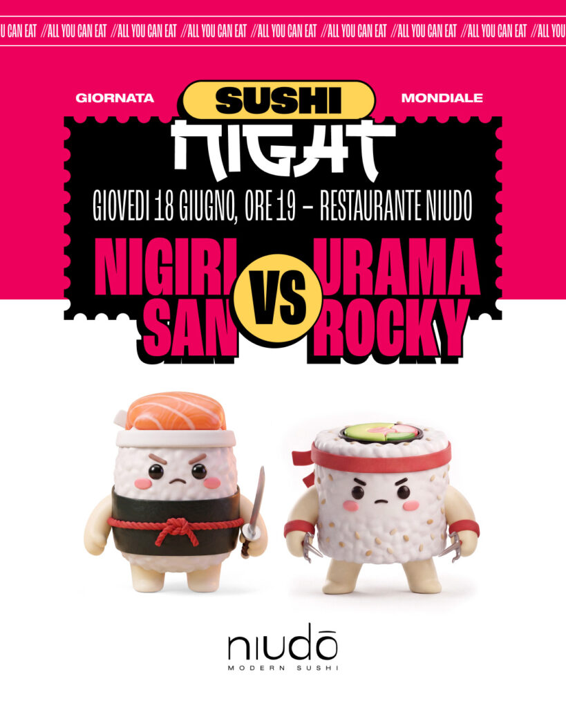
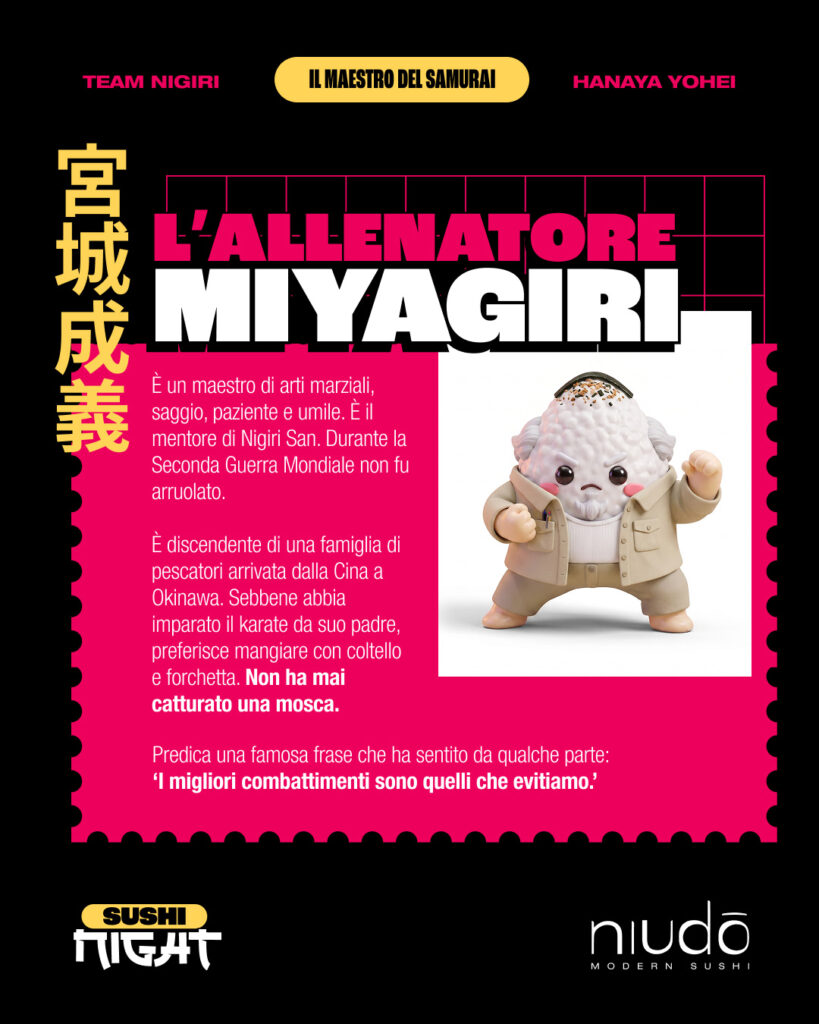
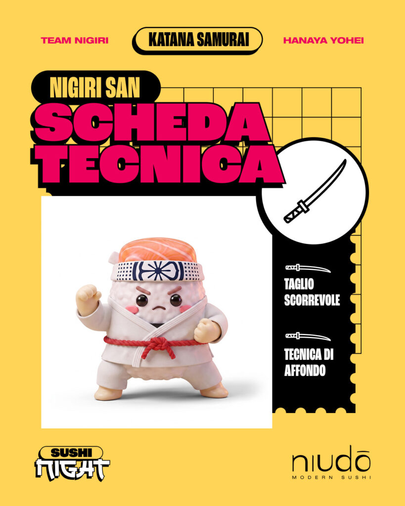
6. Final Design Gallery
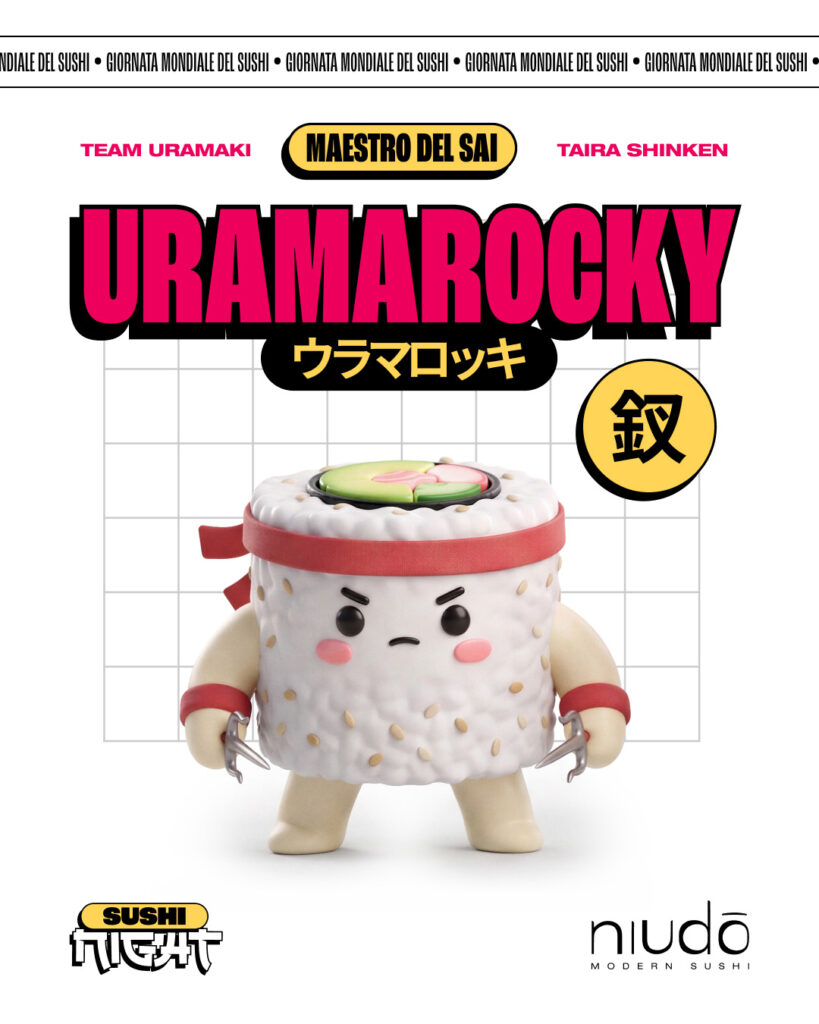
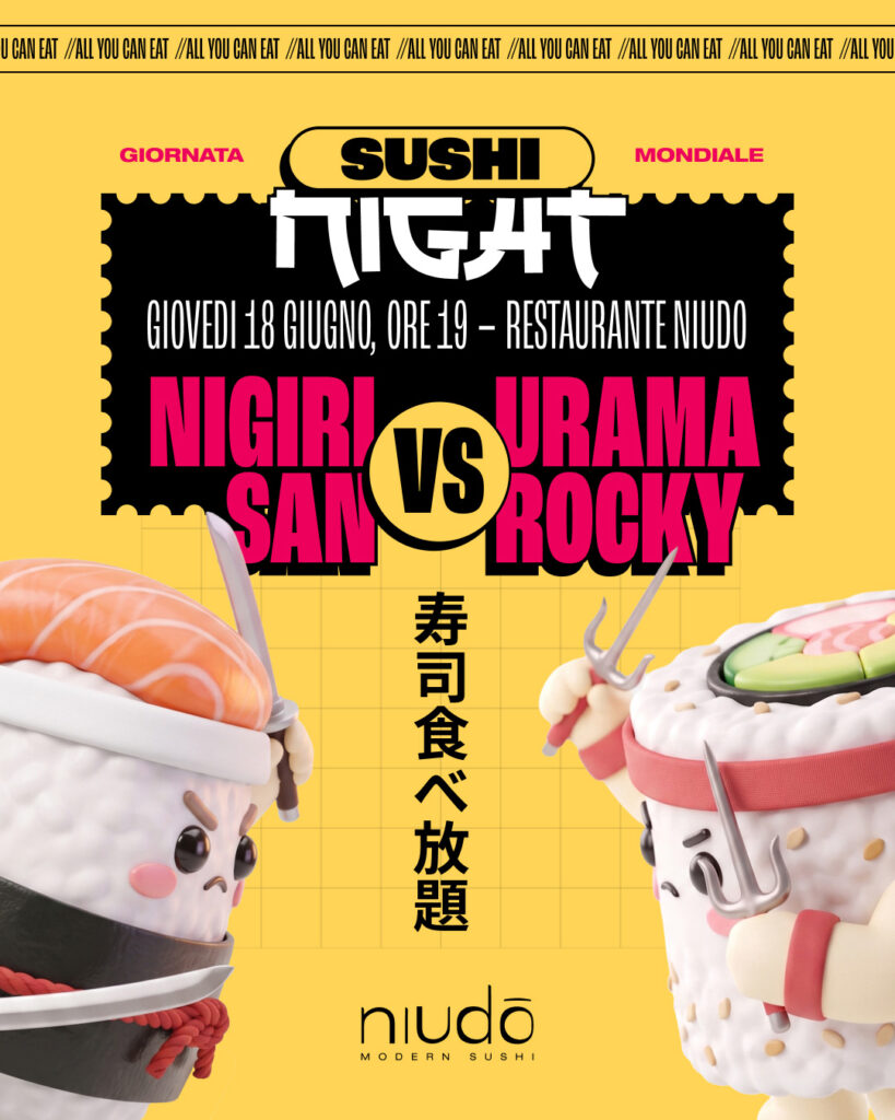
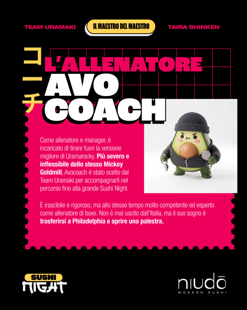
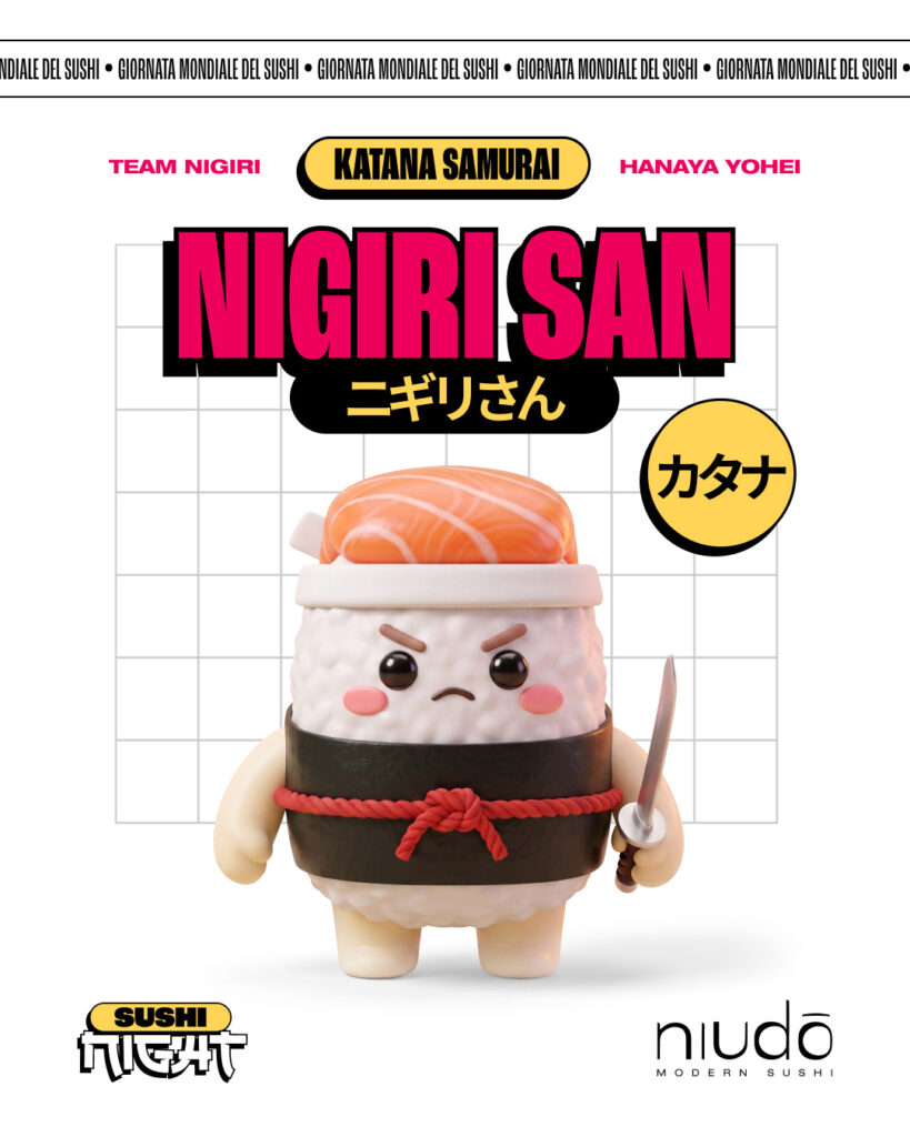
7. Conclusions
Maybe you start by trying a headline on a poster, using those giant shadow shapes inspired by Tadanori Yokoo’s work, only to realize later that it just doesn’t work with your poster. Maybe you think a Japanese-style typeface is going to look amazing, but if the word has more than eight letters, it ends up looking terrible.
In this article, I went through my explorations in numbered order: first this, then that. But the reality is that exploration is not a linear process. And I think that’s one of the best things about it. It’s about researching, experimenting, and taking the opportunity to learn along the way.
Yūsaku Kamekura’s work didn’t give me anything specific that I could apply to this particular project, but while researching, I learned that he and his team developed the first sports pictogram system for the 1964 Tokyo Olympics. Does it help me with this project? Not really. Is it interesting to know? Absolutely. It might come in handy someday.
If your pieces manage to communicate and visually reinforce the campaign concept, you’ve won. I’m always in favor of not limiting yourself to the linear and narrowly defined material your client gives you. You can always try to expand the visual universe, dig a little deeper, and look beyond what’s right in front of you, while still keeping everything in brand. Worst case scenario, your client says no.